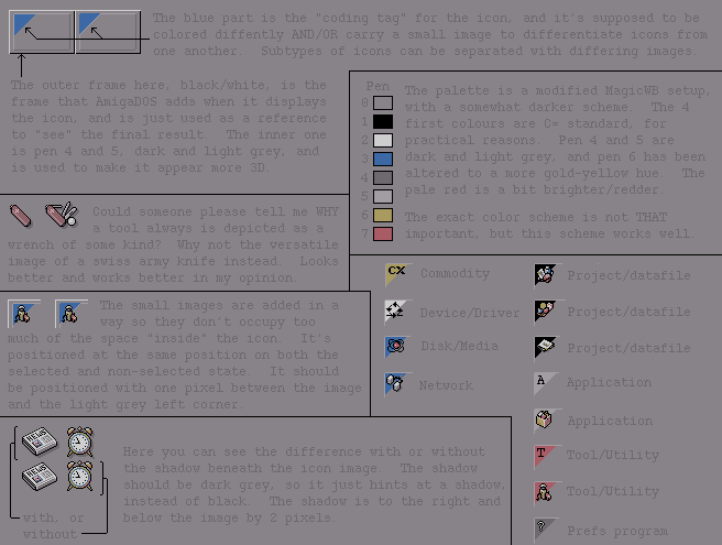
Labels:text | screenshot | software | number | font | parallel OCR: The blue part is the "coding tag" for the icon, and it's supposed to be colored diffently AND/OR carry a small image to differentiate icons from one another. Subtypes of icons can be separated with differing images. The outer frame here, black/white, is the Pen frame that AmigaDOS adds when it displays The palette is a modified MagicWB setup, 01234551 the icon, and is just used as a reference with a somewhat darker scheme. The 4 to "see" the final result. The inner one first colours are C= standard, for is pen 4 and 5, dark and light grey, and 2 practical reasons. Pen 4 and 5 are is used to make it appear more 3D. dark and light grey, and pen 6 has been 4 altered to a more gold-yellow hue. The pale red is a bit brighter/redder. Could someone please tell me WHY a tool always is depicted as a The exact color scheme is not THAT wrench of some kind? Why not the versatile important, but this scheme works well. image of a swiss army knife instead. Looks better and works better in my opinion. CX Commodity Project/datafile The small images are added in a way so they don't occupy too Device/Driver Project/datafile much of the space "inside" the icon. It's positioned at the same position on both the Disk/Media Project/datafile selected and non-selected state. It should be positioned with one pixel between the image Network A Application and the light grey left corner. Application 1 Here you can see the difference with or without T Tool/Utility the shadow beneath the icon image. The shadow should be dark grey, so it just hints at a shadow, instead of black. The shadow is to the right and Tool/Utility with, or below the image by 2 pixels. without Prefs program